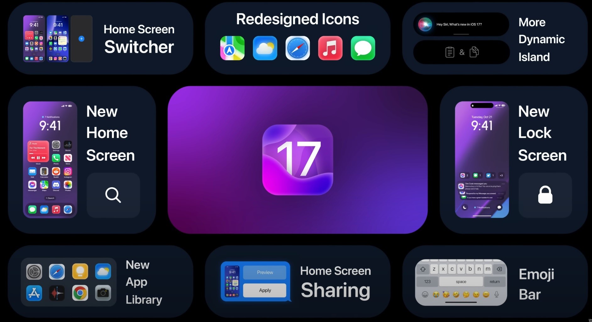
Top 10 new features packed with Apple iOS 17
The lock screen has customisable fonts, and you can add your preferred wallpaper from your photos. You also got an optional depth effect for the wallpapers. Live Text is currently supported for videos.
The Freeform whiteboard app, Apple Music Sing, and end-to-end iCloud encryption were recently launched with the iOS 16.2 update. Unfortunately, Apple removed the Parallax effect option from static wallpapers; and it has been missing since the launch of iOS 16.
Every year, Apple has been adding long-requested features to iOS that were already present on Android flagships. The iPhone 14 Pro lineup of phones now have Always On Display. Battery percentage and keyboard haptics were long overdue. Widgets were introduced with iOS 14 in 2020, and Apple was too late to join that party.
Focus Modes and Live Text were introduced with iOS 15, and Live Text was a feature with the Google Lens app for a long time. As discussed earlier, iOS 16 has some features inspired by Android too. In this post, we’ll cover all you need to know about iOS 17; and explore what Apple might borrow from Android this time.
iOS 17 new features

1: Interactive home screen widgets
The home screen widgets look good, and the design is pretty modern. However, the functionality aspect is missing. A simple strike to clear out reminders or the ability to edit notes with 3D/ Haptic Touch would be a fantastic addition. You can already control Music from the widget.
If widgets are more interactive, it will reduce the point of opening the parent app for menial tasks. Simple sliders can be a great addition. A widget to conveniently view and reply to emails, reply to messages, or view Tweets and Reddit posts will make iOS widgets much better.
2: Homescreen customisation
You won’t see an iOS post without the mention of customisation. There’s no theme store, so we can’t conveniently apply themes to redesign the user interface radically. While Apple might not want to add a full-blown user-powered store like MIUI or ColorOS, a theme store that’s limited and controlled by Apple with a few designs every few months is not a bad idea.
Apple does not quickly let you customise your iPhone because they currently have a reputation for standing out with their software. You’ll know it’s an iPhone after a glance at the UI design. If they let people apply random themes, they might lose this instant recognition.
- If not a theme store, the ability to effortlessly edit icons and icon sizes would be a welcome addition. We also need the option to change the app grid layout and the ability to place apps wherever we want to. While some of this is possible with third-party apps, it gets incredibly clunky and time-consuming.
- If you want to apply your icons, it’s a cumbersome and lengthy process since you have to download the icons you wish to, create a shortcut for every app one by one with the Shortcuts app, and then apply them individually.
- 3D/ Haptic Touch is still pretty lacklustre, and they can add an option to update apps via 3D Touch or other subtle tweaks to make it worthwhile. More widget sizes and icon sizes will improve the aesthetics of the UI, too, though it probably won’t happen.
- iOS 16 has a lock screen switcher. Long pressing will reveal the rest of your lock screens, and you can switch between them. If they add more customisation, iOS 17 needs a similar feature for the home screen.
3: Improved Multitasking
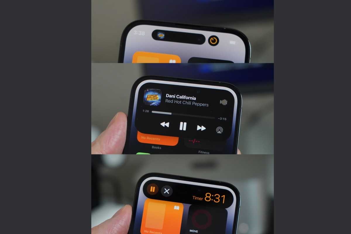
iOS can multitask with the Dynamic Island on the 14 Pros, and it’s just the picture-in-picture mode for other iPhones. Android phones have had Split Screen multitasking for a long time, a feature missing on iOS.
We still don’t have resizeable floating windows on iOS, either. They’re handy features. This feature has several use cases, like reading a post while typing notes, editing photos while scrolling through your Twitter feed, chatting on a Messaging app while watching a video or playing a game, etc.
Some skins have a sidebar where you can quickly launch apps you pinned or your recent apps. You can also pin multiple apps to it simultaneously and launch them simultaneously. Adding a sidebar that’s a toned-down Dock of macOS will still massively improve the multitasking capabilities.
It’s disappointing that Apple’s chips have so much horsepower, yet the software is the bottleneck since you can’t take advantage of it. It’s unrealistic to expect a feature similar to Stage Manager. We probably won’t see the elements and the amount of multitasking on Android, either.
4: Stability

iOS 16 has had several issues with display quality control. Hardware issues aside, there were several visual errors, like disappearing widgets or random phone crashes and freezes. App crashes and UI inconsistencies with font and design errors were reported extensively.
Problems with thermals were extensively reported, and so was increased standby drain. Worse overall battery life too. Random Wi-Fi disconnection, AirDrop bugs, and black wallpapers are a few. Apple typically has a reputation for providing stable software with fewer bugs than Android, but iOS 16 has destroyed that reputation.
For iPhone 14 Pro users, there were many bugs with the Dynamic Island feature. iOS 16 has been the most unstable version by far, surpassing the infamous iOS 13 in terms of instability. Many iOS users would be satisfied with a new version that offers fewer new features but focuses on stability and bug fixes instead.
5: UI/ UX Redesign
It’s probably pointless to expect a radical redesign with new icons and fonts and a theme revamp since it will probably not happen for a long time. iOS 7 was an extensive UI redesign, and iOS 8 and 9 followed up by modernising the looks of the icons. Since then, all icon changes made were pretty subtle.
UI design began with skeuomorphism that represented real-life objects to remind people of the function of an app. Later, the design moved to flat 2D icons, overall minimalism, and a glass-morphism design with Gaussian Blur, Bold Fonts, and aesthetic System Apps.
It’s interesting to note that macOS design has not stuck to 2D apps but has evolved to new morphism. macOS icons aren’t skeuomorphic but have a near-3D shape, depth, shadows, and gradients. This looks refreshing, and it’ll be nice to see iOS adopt a new-morphic design with icons that have depth, shadows and gradients.
6: Background tasks

A long-standing complaint with iOS is the way it handles background tasks. For all Google apps like Google Photos or Drive, uploads and downloads do not happen in the background. Downloading large files from Safari does not work in the background either.
Game updates, Spotify Playlists, Netflix shows, etc., don’t download content when the app is minimised into the app switcher. This is due to Apple’s ultra-aggressive background task management. It helps the battery but hinders productivity, annoys users, and wastes time.
The background upload/ download API does exist, but there’s still a set time limit for how long apps are allowed to run in the background. Since some people prefer this system for whatever reason, a simple toggle in the Settings app to turn off this aggressive background task management will be great.
They can give you a warning popup about the battery effects. iPhones with 6GB of RAM run some background tasks, but the overall system is undoubtedly a hit-and-miss. iPhones with 4GB of RAM have some of the worst background tasks on a 2022 phone.
7: RCS Support for iMessage
iMessage is primarily a popular messaging tool in the USA and is available only on iPhones. This benefits Apple since it creates a lock-in mechanism, and people buy iPhones to stay in group chats due to peer pressure. Adding RCS support will make messaging better for everyone. Apple still supports the insecure and outdated MMS/ SMS standard.
8: Universal Battery Widget
The current battery widget shows you the battery percentage of your other ecosystem devices, like your iPad, Apple Watch, or MacBook. Letting you see the remaining battery of all your devices in one single widget will be pretty convenient.
9: Predictive (T9) Dialling
T9 dialling or predictive text has existed on Android phones forever. When you type a number in the dialler, predicted contacts appear on Android phones. Nothing shows up on iOS; the contact name is only displayed after you type in the entire number.
10: Better Siri
Siri on iOS is functional but barely fulfils the minimum requirements of an excellent virtual assistant. Since Apple claims that it does not collect your data, the assistant cannot understand you.


