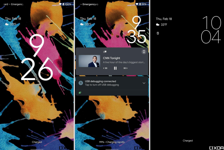
Stacked Widget and new lock screen in Android 12
A series of leaked images surfaced online of Google's Android 12 updates a couple of weeks ago. Then Google officially made its Android 12 developer preview available and let developers explore the new UI and features of Android 12. In the past few days, there were so many tweak and features that Android 12 will offer, which also involves UI changes.
First up: Stacked widget, similar to iOS can be seen in this tweet
Is...is this the beginnings of a widget stack? This is an "enhanced" and "expanded" smart space. pic.twitter.com/9tnfK2kA5a
— Mishaal Rahman (@MishaalRahman) February 18, 2021
The "expanded smart space" feature, which let the user scroll between widgets occupying the same space on the home screen. It’s similar to the Smart Stacks feature introduced in iOS 14, which allows you to “stack” widgets of the same size and scroll between them.
XDA Developers has also confirmed some of the previous leaks that surfaced online for the UI changes. It’s been able to enable a new lock screen and always-on display, with larger clock text that’s stacked with the hours on top of minutes. On the lock screen, it floats to the right when notifications come in. The always-on display also shows a new placement of notification icons in the upper left of the screen.

It’s hard to know what these UI changes will look like in their final form, but we do know that Google is planning to change its UI like notification appearance and give the user a whole new perspective and experience. These developer preview hints give an interesting look at what other changes might be in store.


