Nothing launcher is available now!
- Nothing Launcher is now available as a public beta.
- The default launcher for the future Nothing Phone 1 will be this.
- The launcher doesn't have much going on right now, but it does offer you a taste of what's to come.

Carl Pei's new company, Nothing, announced its intention to launch its first smartphone in 2022 earlier this year. The Nothing Phone 1 has yet to be given a release date, but we now have our first look at how it will function once it is unboxed.
The Google Play Store now has the Nothing Launcher, which was published as a public beta today. It'll work on a select few Android phones, including the Samsung Galaxy S21 and Galaxy S22 series, as well as the Google Pixel 5 and newer. Support for OnePlus will be available soon.
Nothing Launcher: What’s it like?
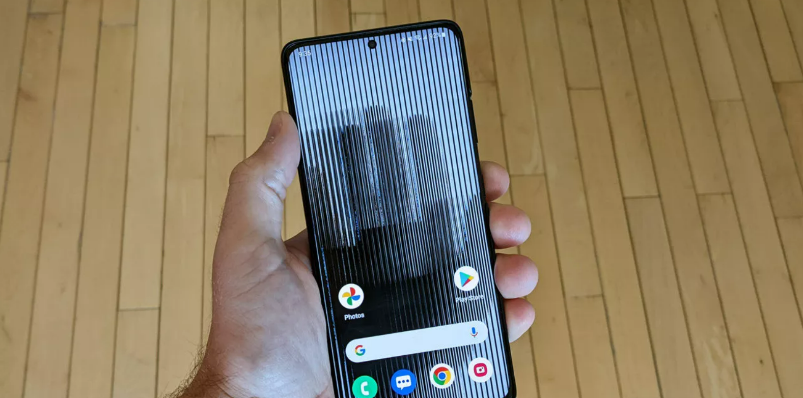
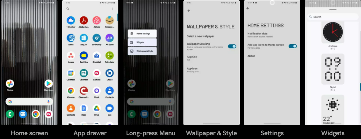
The Nothing Launcher comes with a fairly standard layout when you initially install it. In the dock, there are four icons, a Google Search widget above them, and two more icons above that. Nothing created the default icon pack, which converts icons into circles, similar to the Pixel launcher.
Because it blurs icon names and makes the status bar illegible, the default wallpaper is objectively terrible. Long-press on a vacant portion of the home screen, select Wallpaper & Style, and then Select a new wallpaper to change the wallpaper. However, this simply takes you to your phone's default wallpaper selection, which in my case is Samsung's.

Once you're in the settings section, there are only a few items you may modify. You can select to have new apps automatically added to your home screen or to have notification dots on icons turned on or off. That is all there is to it.
With a smooth grey background and icons with black text labels, the app drawer is likewise wonderfully simple. At the top, there's a search box that only searches applications and nothing else.
There are several useful widgets available, including an analogue clock, a digital clock, and weather data. Each one features the brand's black/red/white design or the Nothing "dots." The widgets, however, accomplish nothing exceptional other from the aesthetic.
Overall, the Nothing Launcher is a disappointment. Obviously, this is a beta, and it will improve with time. If Nothing was intending to wow people right away, this is more likely to disappoint them than anything else.


