Check out features Of ColorOS 13: Update Hands-On & First Look
OPPO is now taking its design-first approach to software engineering one step further. OPPO’s smartphones, reaching as many as 160 million users in more than 60 countries and regions. The UI is therefore built to be fluid and vibrant, adapting easily to the users' needs and expectations.
The software engineering team at OPPO has revamped the system theme color selection and has included smooth animations and adaptive layouts to accommodate all the different devices that will receive the new update in the next few months. The goal was to offer the user a concise and human-centered experience.
ColorOS 13 introduces Shelf, Widgets, and Large Folders, which all boost the efficiency of display real estate management on a wide array of devices with highly variable screen ratios and sizes. ColorOS bears similarities to OxygenOS, and while the idea of unifying both operating systems has been scraped, you can still see some obvious similarities between the two. Since its inception, ColorOS has evolved into becoming quite feature-rich and pretty user-friendly.
Here is the list of features:
1. COLOROS 13: VISUAL CHANGES
2. COLOROS 13: HOME SCREEN AND CONTROL CENTRE
3. COLOROS 13: PRIVACY AND SECURITY
4. Private Safe on ColorOS 13
5. COLOROS 13 ROLLOUT SCHEDULE
6. COLOROS 13: VERDICT
7. Automatic screenshot pixelation
8. Blossom wallpaper
9. Multi-Screen Connect
10. Shelf
11. Always-on Display
12. PC Connect
13. Kid Space
14. ColorOS 13 Easter Egg
1. COLOROS 13: VISUAL CHANGES
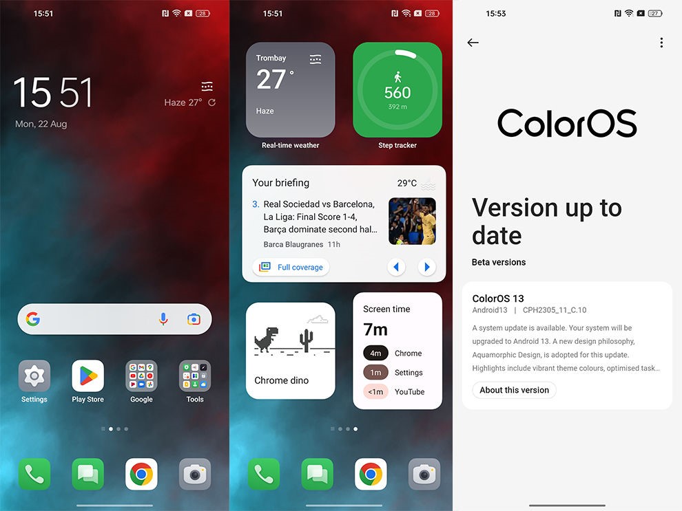
Oppo has brought a visual overhaul to ColorOS 13 and a couple of iterative upgrades over ColorOS 12. It makes sense since Android 13 is also a comparatively small, iterative upgrade to Android 12. ColorOS 13 has adopted a design language dubbed “Aquamorphic Design” which is inspired by water and its motion. This is apparent in the smooth transitions and animations, and the use of more rounded shapes for icons, folders, and widgets – meant to emulate pebbles.
The shade also changes throughout the day, to emulate sunrise and sunset times. You can change the system colour based on your wallpaper, but the implementation isn’t solid, and sadly, there’s no Material You implementation yet as well.
2. COLOROS 13: HOME SCREEN AND CONTROL CENTRE

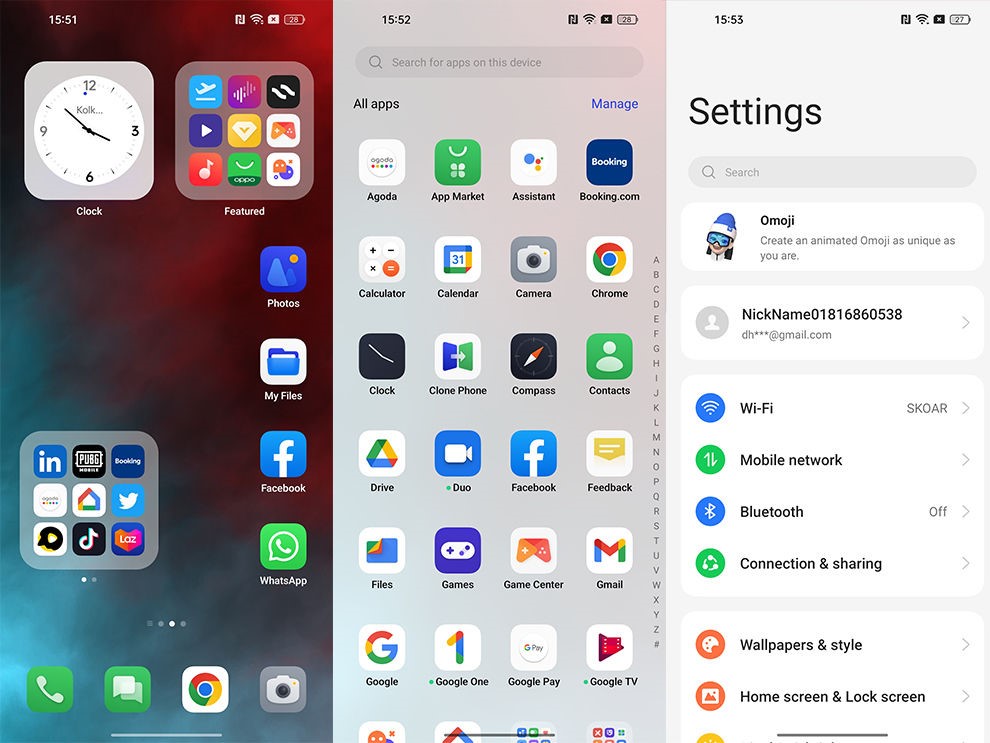
The newly-designed app icons, that we spoke about above, are meant to be more recognisable and readable – even for people with visual impairments, according to Oppo. While we wouldn’t go that far, we can definitely say that the contrast has been upped to make icons more recognisable. You can also swipe within the folder to access more apps. We found these enlarged folders quite nifty, but since they eliminate the app’s name, you should use these with easily recognisable app icons to avoid confusion. Oppo drew inspiration from iOS here and that’s clear, but it’s still nifty nonetheless.
ColorOS also comes with a Shelf that’s very similar to OnePlus’ Shelf. You can pull down anywhere on the screen to access it. There’s not a lot you can do with the Shelf at the moment except add some custom widgets and Spotify integration.
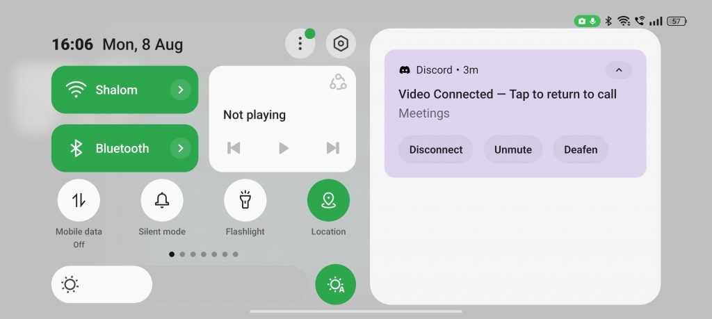
The Control Centre has been redesigned as well. The top part of the Control Centre houses two large toggles on the left and a media playback widget on the right. These toggles alongside the top five tiles are available even if you swipe down the notification bar just once, making them easy to access.
3. COLOROS 13: PRIVACY AND SECURITY
ColorOS 13 has integrated some of the underlying privacy capabilities of Android 13 such as deleting clipboard history after a designated period of time. There’s also the Nearby Wi-Fi feature that allows users to use Wi-Fi without revealing any specific location information. ColorOS 13 can automatically pixellate avatars and names in screenshots of chats. It uses AI algorithms to intelligently predict which part of the chat needs to be blurred out.
When we used this feature, it seemed buggy since there were many instances when the phone just gave out an Auto Pixelate error. Nevertheless, at times, it did work as advertised. Hopefully, the feature gets more stable and reliable over time since it is something that’s pretty useful. This feature is available in Oppo’s Messages app, WhatsApp, and Facebook Messenger for now.
4. Private Safe on ColorOS 13
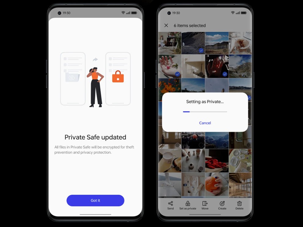
Another privacy feature added by Oppo is the Private Safe. This is a folder that is encrypted using the AES algorithm that stores the files in a private directory.
5. COLOROS 13 ROLLOUT SCHEDULE
Due to Oppo’s close ties with Google on the Android OS front, Oppo users usually benefit from earlier and timely updates for their devices. Oppo has shared a tentative ColorOS 13 rollout schedule that is subject to change, so take it with a grain of salt. Oppo notes that all of these upcoming ColorOS 13 updates will be based on Android 13. Here’s the tentative rollout schedule:
- From September 2022:Reno8 Pro 5G
- From October 2022:Reno8 5G, Reno7 Pro 5G, Reno7 5G, Reno6 5G, F21 Pro, K10 5G, A76
- From November 2022:Reno6 Pro 5G, Reno6 Pro 5G Diwali Edition, Reno5 Pro 5G, F21 Pro 5G, F19 Pro+, K10, A96
- From December 2022:Find X2, A74 5G
- From H1 2023:Oppo Pad Air, F19 Pro, F19, F19s, A77, A57, A55, A53s 5G
6. COLOROS 13: VERDICT
Oppo continues its trend of improving its OS year after year with ColorOS 13, be it in terms of aesthetics, features, or security. While there are still some bugs and tons of bloatware, ColorOS 13 feels more fluid and responsive than its previous renditions. The visual flair and tweaks are quite elegant yet they don’t feel garish.
7. Automatic screenshot pixelation
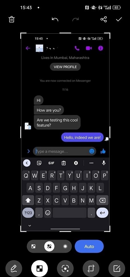
That takes time, and I’ve found myself having to edit my screenshot and draw over it, which can be annoying. ColorOS 13 adds a feature to automatically pixellate these identifying elements of your screenshot, which in turn saves you time. Currently, the feature is fairly primitive. It only works in Facebook Messenger and WhatsApp for the moment. It uses AI to identify elements that need to be blurred out. It’ll wipe out a contact’s name and profile picture wherever it’s shown — when it works — though I find myself still needing to do it manually sometimes. It’s not completely consistent in Facebook Messenger but works most of the time.
8. Blossom wallpaper
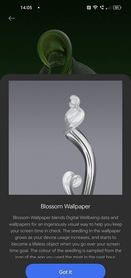
ColorOS 13 adds a new Blossom wallpaper, and it’s a pretty interesting way to measure your phone usage. You can set a maximum length of time to use your phone during the day, and as you use your phone, a plant will grow on your wallpaper.
9. Multi-Screen Connect
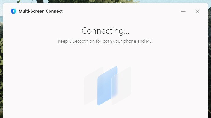
Multi-Screen Connect is a feature that sounds cool in practice but is kind of broken at the moment. I can connect to my phone from it by scanning a QR code, but the network detection support is iffy at best. Sometimes it works, sometimes it doesn’t, and not everything works, either. I could open Google Chrome into its own window that was still controlling my phone, while then swiping and navigating other apps, too. It was surprisingly versatile, and I could see it being useful at times if you do a lot of organization on your smartphone.
10. Shelf
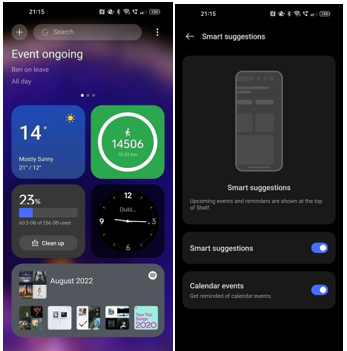
If you’re familiar with the OnePlus Shelf, that’s… basically what this is. It’s not exactly a subtle recreation of the feature, and it works the exact same way as it does on OxygenOS 13. You can pull it down anywhere on the launcher to invoke it, though you can’t access it from within other applications at the moment. You’ll also need to enable it within the launcher — by default, pulling down will just access your notifications.
Shelf looks good and is fluid to use
There’s not a whole lot that it can do currently, but it integrates with Spotify and allows you to add some custom widgets to it that can be accessed quickly from your home screen. It looks good and is fluid to use, so I think that with some tweaks to make it more usable across the system, it could be really good. I think that it could do with taking some inspiration from MIUI‘s Control Centre, as that’s a lot more useful.
11. Always-on Display
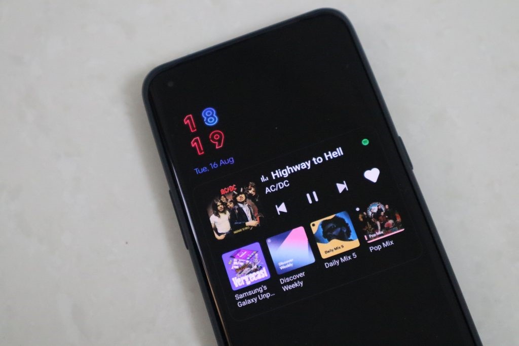
ColorOS has one of the best always-on display (AOD) implementations. With ColorOS 13, it gets even better with more AOD styles and integration with third-party apps. Oppo has introduced a new AOD style series called ‘Home’. It showcases how the earth is affected by global warming. Users can choose from three styles featuring polar bears, penguins, and a coral with clown fish.
Talking about third-party applications, Oppo has partnered with Spotify and Indian food delivery companies Zomato and Swiggy for always-on display. Apps offered by these companies will be displayed on AOD. Spotify AOD shows the music that’s currently playing along with controls and icons of the four most-played playlists. On the other hand, the India-exclusive Zomato and Swiggy AOD will show useful information like ‘Order accepted’, ‘Meal picked up’, ‘Distance to destination’, and ‘Delivered’.
12. PC Connect
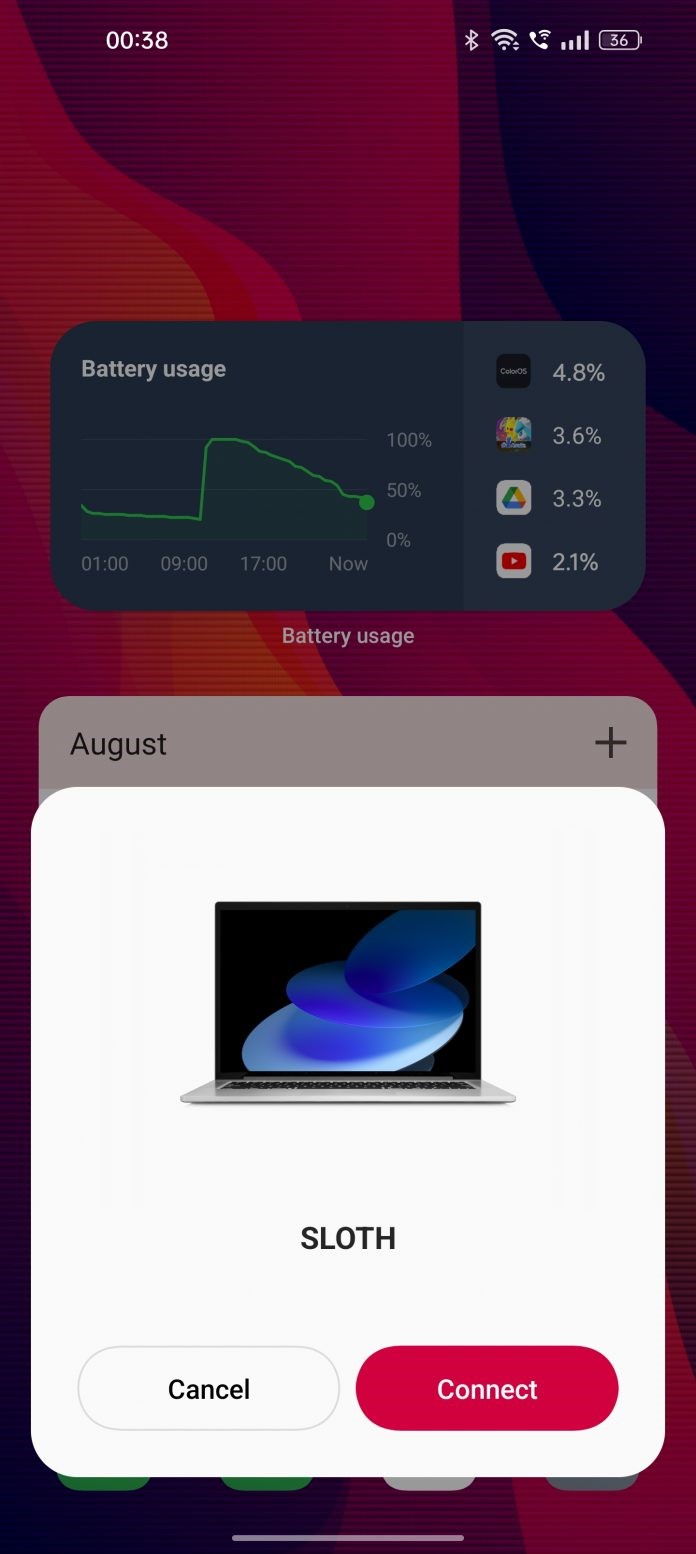
Oppo introduced PC Connect with ColorOS 12. As of now, there are no new changes in the beta build I used but the company has revealed plans to add more features in the later releases of ColorOS 13. The firm says that it will be adding functionalities like natively answering calls and sending/receiving messages on the computer. In other words, PC Connect will become more of a Microsoft Phone Link rather than simply mirroring the screen.
Hence, apart from the upcoming new features, users can also make use of the existing features like notifications sync, clipboard sync, and file transfer. With more refinements like these, PC Connect may become richer in features like Huawei Multi Screen Collaboration and Samsung DeX in the near future.
13. Kid Space
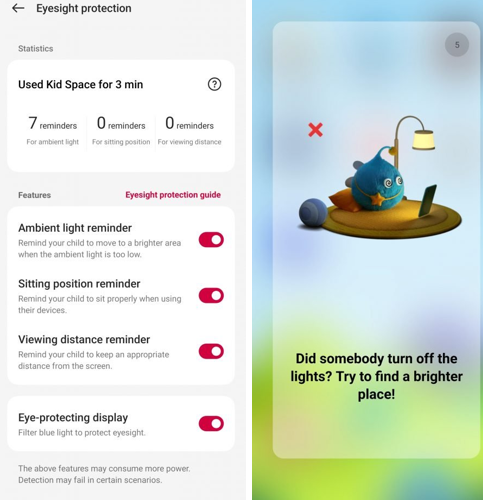
ColorOS has had Kid Space for a while with no new additions. After years, it finally gets a useful new feature in ColorOS 13. The new feature relies on the phone’s hardware to protect the eyesight of kids. It gives three different types of reminders pertaining to sitting position, viewing distance, and ambient light. Parents can also go through all the reminders issued by the phone during the Kid Space session. Hence, they can teach their kids to use smartphones properly.
14. ColorOS 13 Easter Egg
More customization options with wallpapers
You can create your own wallpaper from an image stored on your phone, using colors from the image that you select. The wallpapers it creates aren’t all that unique as it uses the same geometric shapes each and every time, but it’s a cool gimmick that you can pair with Material You to have a bit of a unique take on your phone’s look.
ColorOS 13 is a smaller upgrade filled with improvements and cool features
Android 13 is a lot more of an iterative improvement than Android 12, and there’s nothing wrong with that. There are no big overarching changes that redefine what we know Android to be, and that doesn’t have to be the case every time.
Conclusion
Nevertheless, we quite enjoyed the revamped look of ColorOS 13. It looks a lot more classy, fluid, and simple. Although it’s not quite as simple and minimalist as Stock Android or even One UI, this is a step in the right direction. The notifications area resides below the control center in portrait view. However, in landscape view, like during playing a game or watching a video, the notification pane shifts to the right side, while the control center remains on the left. This makes it easier to access quick toggles and respond to notifications.
OPPO's Director of Software Design. "Water is seen as a symbol of hope and vitality in every culture. And water, as it turns out, is just how we envision our technology: peaceful, vibrant, all-pervading, but silently impacting our life."


